#landingpage
#web
#Figma
Paket1a
Paket1a
Paket1a is a logistics company information website and provider of parcel delivery services available in Germany.
Paket1a is a logistics company information website and provider of parcel delivery services available in Germany.
Country
Germany
Year
2022
My Role
Designer
Country
Germany
Year
2022
My Role
Designer
Background
Background
Paket1a need improvement to provide smoother experience for users while accessing parcelshop page in their website.
Paket1a need improvement to provide smoother experience for users while accessing parcelshop page in their website.
Scope
Scope
The design work scope is focused solely on enhancing the parcel shop detail page.
The design work scope is focused solely on enhancing the parcel shop detail page.
Goals
Goals
Make parcel shop page look fresh, clean and informative
Improve visual hierarchy and readibility.
Make parcel shop page look fresh, clean and informative
Improve visual hierarchy and readibility.
Research
Research
To identify problems with the existing website from a visual and experience perspective, I used the heuristic markup method.
This method is implemented by actively engaging with the website, then documenting challenges and shortfall perceived during using the website.
To identify problems with the existing website from a visual and experience perspective, I used the heuristic markup method.
This method is implemented by actively engaging with the website, then documenting challenges and shortfall perceived during using the website.

Identify problems using heuristic markup
Identified Problems
Identified Problems
1
Confusing navigation menu, an access to PacketShop page couldn't be found on the menu
The navigation menu only contains of homepage and tabs of logistic companies that redirects only to page that contains of tracking parcel feature, information details about logistic company and review. The menu doesn’t have an access to parcel shop page.

Confusing navigation menu
2
Access link to the packetshop pages were located in the bottom of the page and on the footer
The access was hard to reach because users had to scroll through the page until the end of the page.
2
Access link to the packetshop pages were located in the bottom of the page and on the footer
The access was hard to reach because users had to scroll through the page until the end of the page.
Access to parcel shops were hard to reach
3
The links on the left side contain too much irrelevant information, and the overall page lacks good visual hierarchy
Links on the left side contains too much irrelevant information, it slows down cognitive load when reading the page because of overwhelmed with a lot of informations. Also bad visual hierarchy make the important informations harder to digest.

Too much information and bad visual hierarchy
Solutions
Solutions
1
Improve navigation menu
Adding access to the parcel shop page and making the menu to other pages more accessible.
1
Improve navigation menu
Adding access to the parcel shop page and making the menu to other pages more accessible.

Improved navigation menu
2
Simplify left side links and improving page section
Simplifying links on the left side to reduce cognitive load, and break the contents into section, and add a spacing to make information easier to read.
2
Simplify left side links and improving page section
Simplifying links on the left side to reduce cognitive load, and break the contents into section, and add a spacing to make information easier to read.

Improved side links and page section
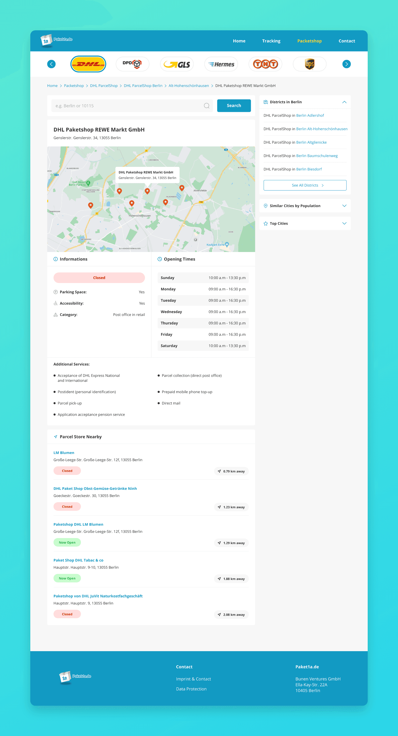
Conclusion
The improved Parcel Shop page is now more accessible, and its information is easier to read and digest compared to before, by reducing irrelevant information and adding sections breaks to each detail information.
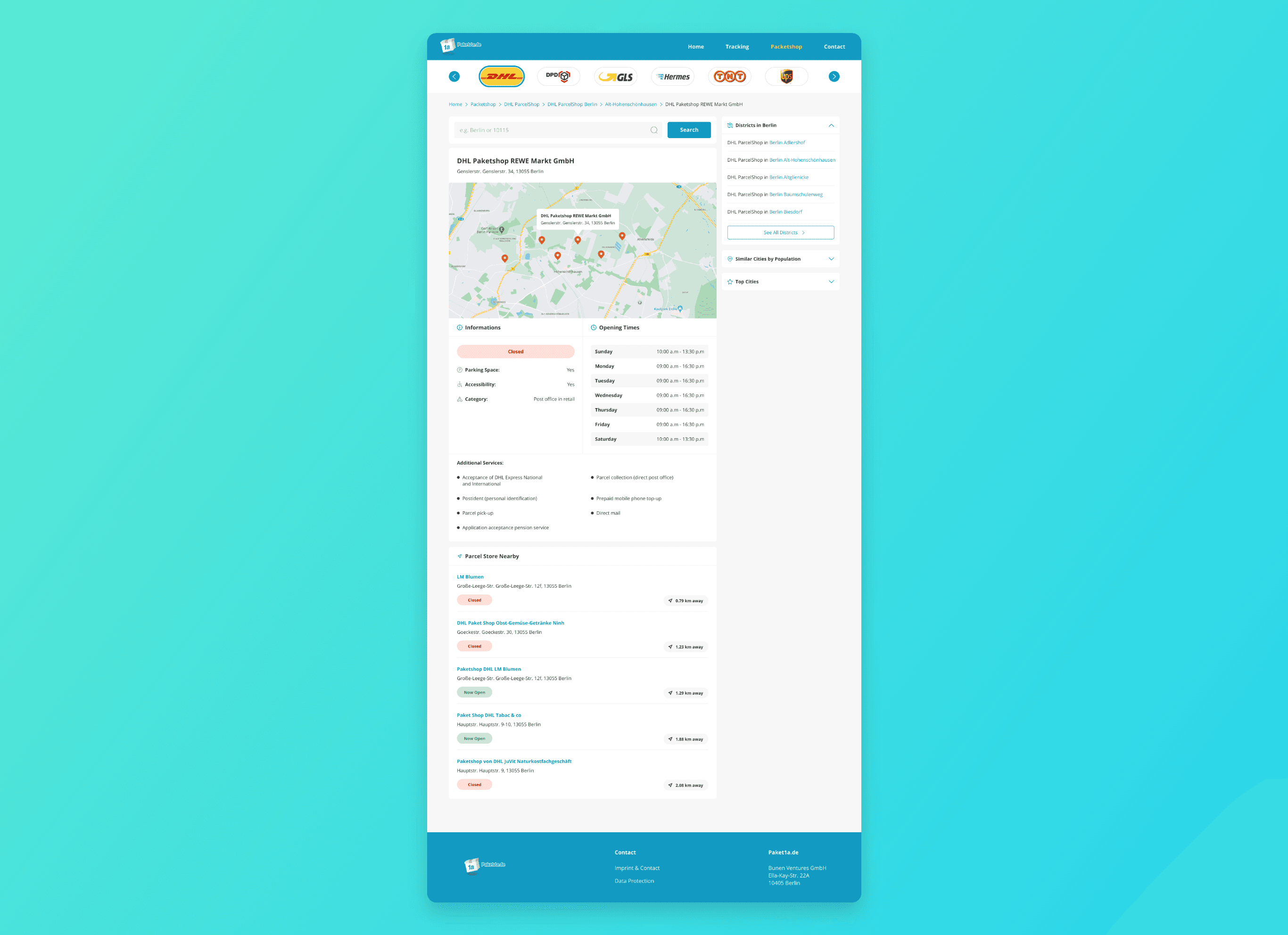
Parcel shop page after improvement
Tools
Tools
Figma
"Great designer and was also able to provide the needed changes"

Eugen Bunen
Project Owner of paket1a.de | Founder of cimenio.com
"Great designer and was also able to provide the needed changes"
Eugen Bunen
Project Owner of paket1a.de | Founder of cimenio.com

