#dashboard
#analytics
#webapp
#Figma
Overall Equipment Effectiveness (OEE) Widget Dashboard
Overall Equipment Effectiveness (OEE) Widget Dashboard
In this case study, I present the design process and outcome of building a user-friendly OEE (Overall Equipment Effectiveness) dashboard. The dashboard was developed for plant managers and supervisors to monitor production performance in real time.
In this case study, I present the design process and outcome of building a user-friendly OEE (Overall Equipment Effectiveness) dashboard. The dashboard was developed for plant managers and supervisors to monitor production performance in real time.

Country
Indonesia
Year
2023
My Role
Designer
Background & Context
Background & Context
OEE (Overall Equipment Effectiveness) is a key metric in manufacturing that reflects equipment effectiveness based on availability, performance, and quality. Our client, a mid-sized manufacturing company, relied on manual spreadsheets and disconnected systems to monitor performance, leading to delays and inefficiencies.
OEE (Overall Equipment Effectiveness) is a key metric in manufacturing that reflects equipment effectiveness based on availability, performance, and quality. Our client, a mid-sized manufacturing company, relied on manual spreadsheets and disconnected systems to monitor performance, leading to delays and inefficiencies.
Users
Users
1
Plant managers
1
Plant managers
2
Line supervisors
2
Line supervisors
3
Company principals
3
Company principals
Business Goals
Business Goals
1
Minimize reporting time through streamlined data access.
1
Minimize reporting time through streamlined data access.
2
Enhance the efficiency of OEE monitoring with clear visualizations.
2
Enhance the efficiency of OEE monitoring with clear visualizations.
3
Eliminate difficulties in comparing performance across production lines.
3
Eliminate difficulties in comparing performance across production lines.
Research & Discovery
Research & Discovery
What do plant managers, line supervisors, and company principals need from an OEE dashboard? To answer this question, We conducted in-depth interviews with stakeholders and identified the specific information they need in OEE dashboard. Here are the key takeaways of their needs:
What do plant managers, line supervisors, and company principals need from an OEE dashboard? To answer this question, We conducted in-depth interviews with stakeholders and identified the specific information they need in OEE dashboard. Here are the key takeaways of their needs:
1
Real time & high-level monitoring
• View real-time OEE values with clear breakdowns (Availability, Performance, Quality). • See OEE trend over time (every 15 minutes, hourly, daily, monthly, quarterly, & yearly).
1
Real time & high-level monitoring
• View real-time OEE values with clear breakdowns (Availability, Performance, Quality). • See OEE trend over time (every 15 minutes, hourly, daily, monthly, quarterly, & yearly).
2
High Level Overview and Detailed Visibility at Plant and Line Levels
• Company principals need a plant-wide OEE summary to provide a high-level overview. • Plant managers and supervisors need to view OEE data by specific production plant and line.
2
High Level Overview and Detailed Visibility at Plant and Line Levels
• Company principals need a plant-wide OEE summary to provide a high-level overview. • Plant managers and supervisors need to view OEE data by specific production plant and line.
3
Benchmark
Compare the OEE score against common industry standards to justify the company’s performance.
3
Benchmark
Compare the OEE score against common industry standards to justify the company’s performance.
Finding The Right Data Visualizations
Finding The Right Data Visualizations
The OEE score is a percentage that ranges from a minimum of 0% to a maximum of 100%. To effectively represent OEE achievement, it is best visualized using a progress bar or progress circle chart. Both chart types clearly show how much of the target has been achieved and how much remains to reach the maximum score, helping users easily understand overall progress.
To visualize OEE trends over time, a line chart is the most suitable option.

Chart comparison
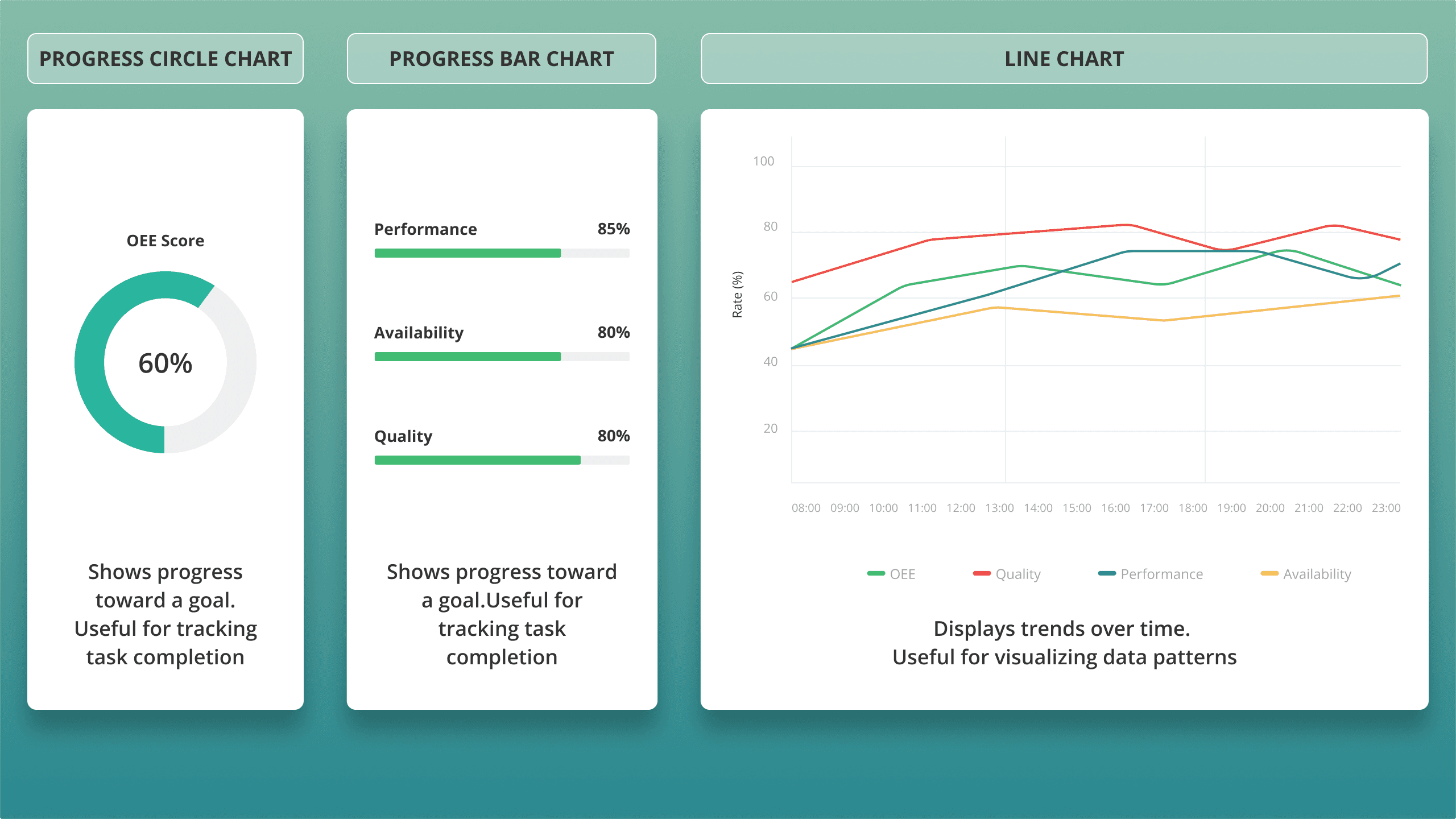
Chart comparison
Organizing The Visual Hierarchy
Organizing The Visual Hierarchy
The OEE score, as the primary value, should stand out more prominently than the other metrics. This is important to provide users with a clear summary of their overall production plant performance at first glance. After that, they can explore the breakdown values (Availability, Performance, and Quality), as well as trends over time.
To establish a clear visual hierarchy, we decided to:
Vary the sizes of the circle and progress bar charts to distinguish the OEE summary from its breakdown values.
Organize the layout using a left-to-right (LTR) design principle, aligning with common reading behavior.

Widget layout
This layout guides users from high-level insights to detailed analysis in an intuitive and visually organized manner.
This layout guides users from high-level insights to detailed analysis in an intuitive and visually organized manner.
Classifiying The OEE Score
Classifiying The OEE Score
We use color classification and text label for the OEE score to provide a clear visual indicator of the performance category achieved by the company.
We use color classification and text label for the OEE score to provide a clear visual indicator of the performance category achieved by the company.
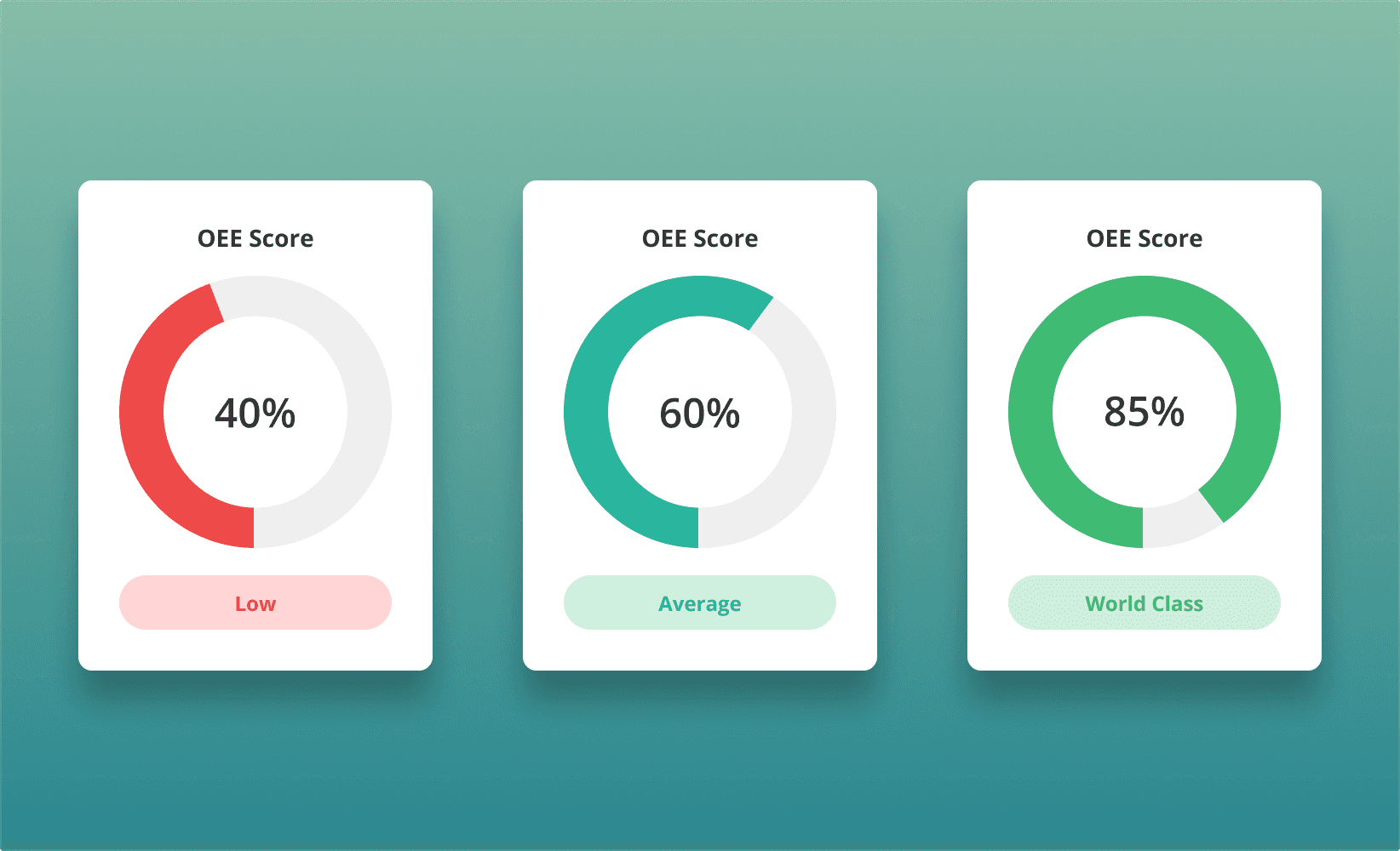
Color coding and text label for OEE score categories
Designing Filters
Designing Filters
Expanded Widget View
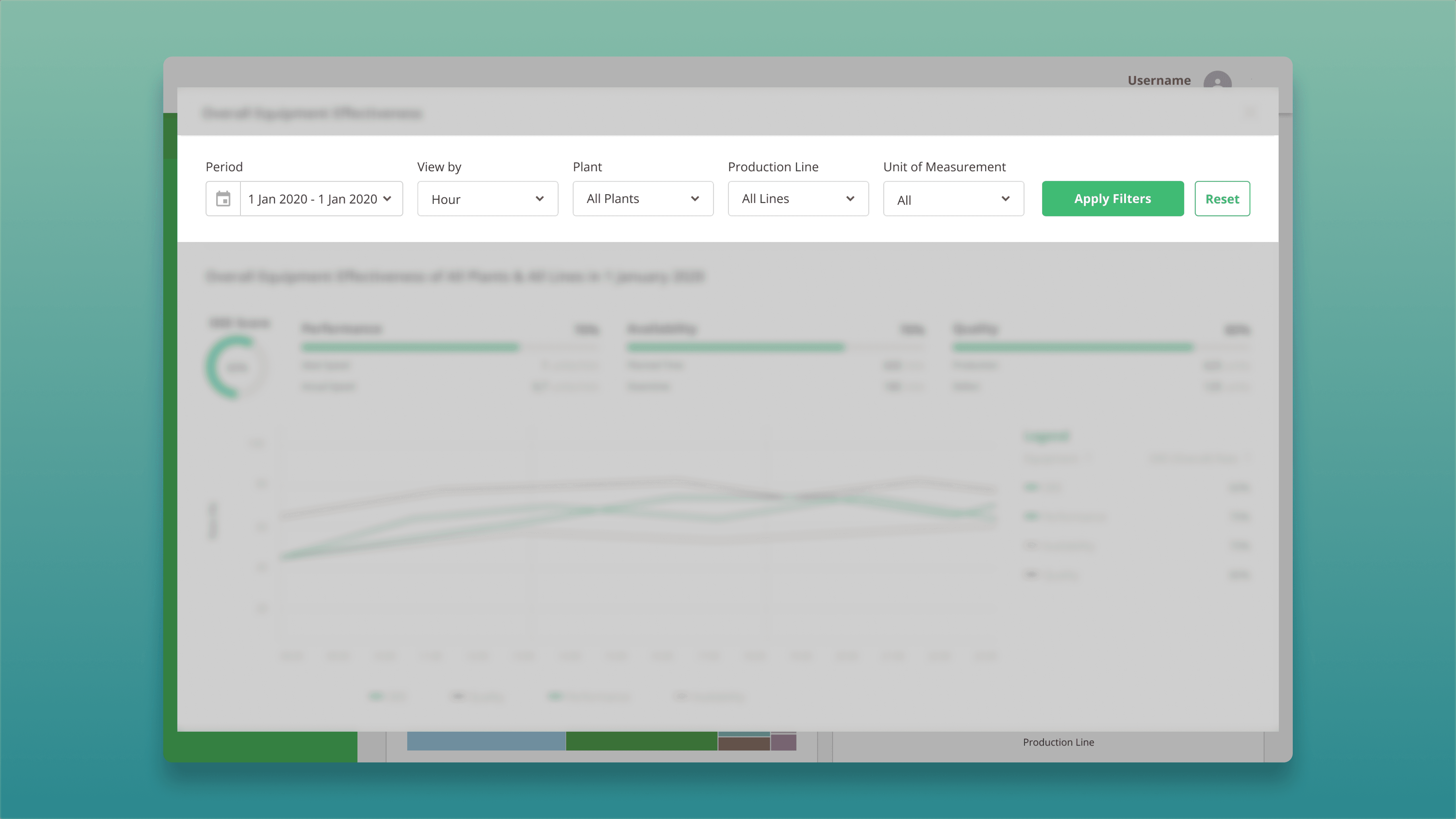
When user click the filters button, it will automatically expand to a wide popup view. This will help user to focus on the filters and the results after filtering on the spesific widget without distraction, while also giving them a broader view of the chart.
Expanded Widget View
When user click the filters button, it will automatically expand to a wide popup view. This will help user to focus on the filters and the results after filtering on the spesific widget without distraction, while also giving them a broader view of the chart.

Expanded View
Top Aligned Filters & Hierarchial Filter Logic
Filters are placed at the top to align with user’s natural top to bottom scanning behavior, improve discoverability, and follow common enterprise dashboard patterns. They are also structured left to right from broad (Plant) to specific (Production Line and Unit of Measurement), reflecting how users naturally drill down from high level overviews to detailed performance metrics.
Top Aligned & Hierarchial Filters
Set Default Value For Quick Interaction
Dropdowns with default values can reduce cognitive load for users. We designed filters with default values to meet specific analysis purposes related to timeframe and scope for each user’s role.
Set Default Value For Quick Interaction
Dropdowns with default values can reduce cognitive load for users. We designed filters with default values to meet specific analysis purposes related to timeframe and scope for each user’s role.
Role
Default Filter Values
Purpose
Line Supervisor
Today + View By Hour + Spesific Plant + Spesific Line
Daily performance review
Plant Manager
This Month + View By Day + Spesific Plant + All Line
Strategic monthly KPI tracking
Company Principal
Last Month + View By Day + All Plants + All Line
Cross-plant comparisons & reports
Role
Line Supervisor
Default Filter Values
Today + View By Hour + Spesific Plant + Spesific Line
Purpose
Daily performance review
Role
Plant Manager
Default Filter Values
This Month + View By Day + Spesific Plant + All Line
Purpose
Strategic monthly KPI tracking
Role
Company Principal
Default Filter Values
Last Month + View By Day + All Plants + All Line
Purpose
Cross-plant comparisons & reports

Example Of Default Filters For The Company Principal
Custom Date Picker with Presets
A dual-calendar date range selector combined with presets like 'Last Month' ensures flexibility for both exploratory and routine reporting use cases.
Custom Date Picker with Presets
A dual-calendar date range selector combined with presets like 'Last Month' ensures flexibility for both exploratory and routine reporting use cases.
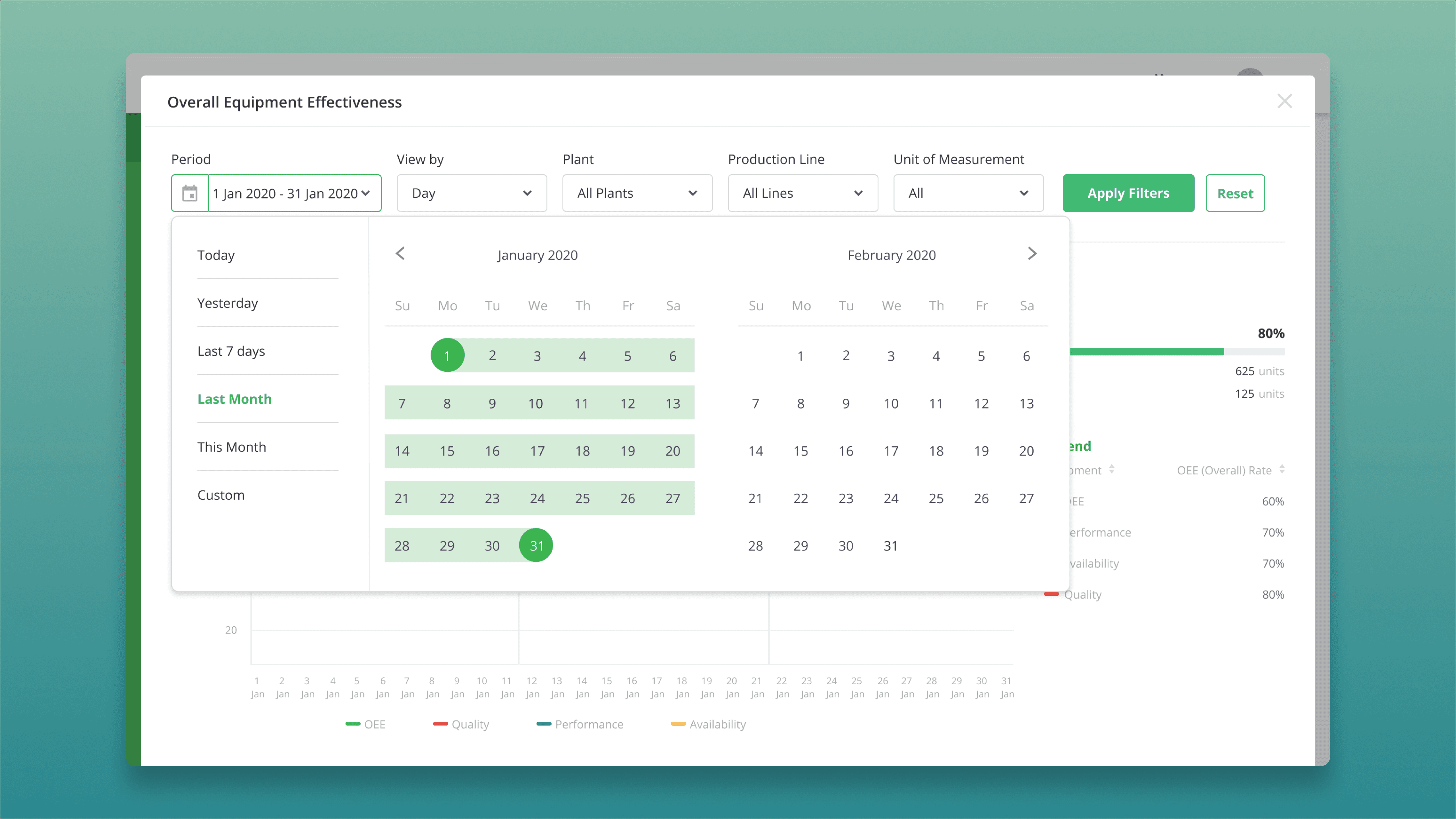
Date Picker With Presets
Testing & Iteration
Testing & Iteration
We conducted usability tests with participants from different roles (Line Supervisor, Plant Manager, Company Principal).
We conducted usability tests with participants from different roles (Line Supervisor, Plant Manager, Company Principal).
Findings
Some users need to see the OEE score ranges for each category to understand how close their current performance is to the lower or upper limit.
Findings
Some users need to see the OEE score ranges for each category to understand how close their current performance is to the lower or upper limit.
Changes Made
Add tooltips to the score category labels that display the score ranges and descriptions for each category
Changes Made
Add tooltips to the score category labels that display the score ranges and descriptions for each category
Final Designs
Final Designs
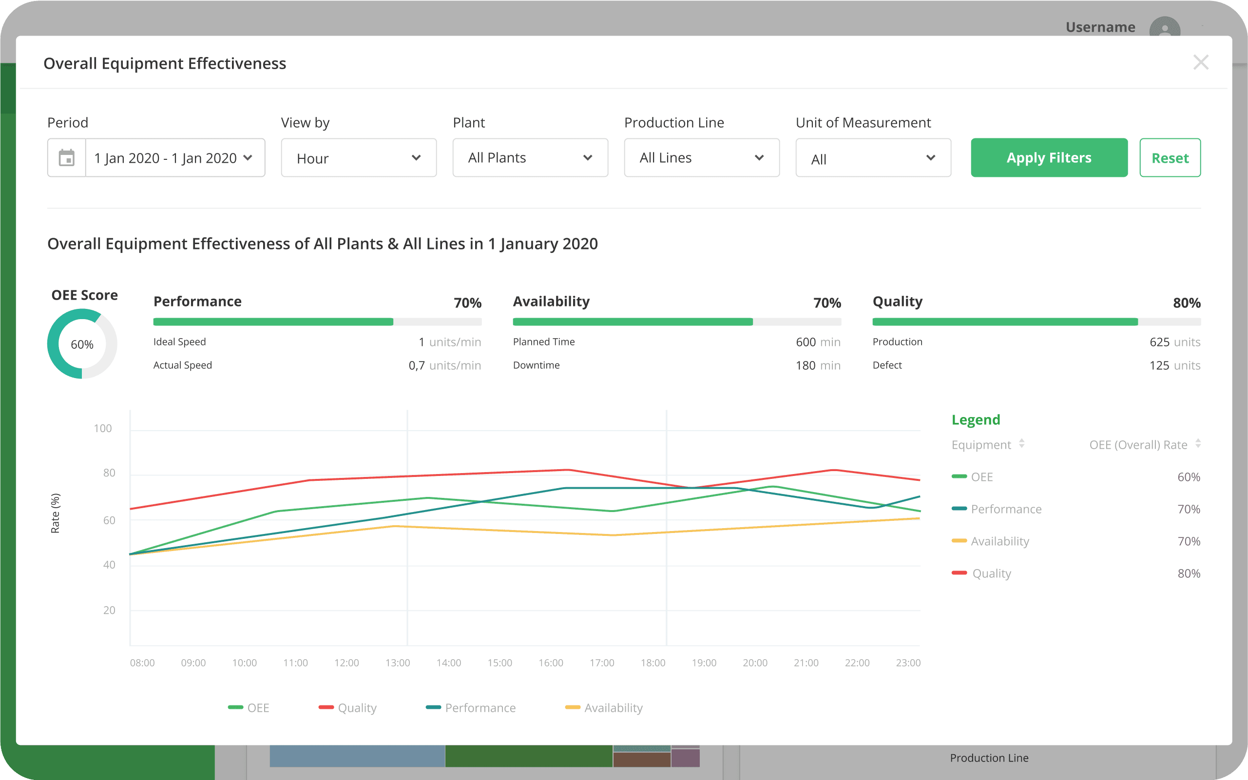
1
Homepage View
OEE score summary, trend and tooltip information for label category
1
Homepage View
OEE score summary, trend and tooltip information for label category

Homepage View

Tooltip information on OEE label
2
Detail View & FIlters
Broader chart view with intuitive filters
2
Detail View & FIlters
Broader chart view with intuitive filters
Detail View

Drilldown FIlters

Period FIlter
Impact & Outcomes
Impact & Outcomes
1
Improved visibility led to faster identification of bottlenecks and downtime causes for all stakeholders.
1
Improved visibility led to faster identification of bottlenecks and downtime causes for all stakeholders.
2
Production line supervisors reported saving 20–30 minutes per day previously spent compiling reports.
2
Production line supervisors reported saving 20–30 minutes per day previously spent compiling reports.
3
User satisfaction surveys indicated improved confidence in data accuracy and decision-making.
3
User satisfaction surveys indicated improved confidence in data accuracy and decision-making.
4
Positive feedback from stakeholders highlighted better alignment between production and maintenance teams.
4
Positive feedback from stakeholders highlighted better alignment between production and maintenance teams.
Tools
Tools
Figma